Business
Helping your Business to grow. Develop a clear growth plan, attract and retain new and existing customers, innovate by improving or developing new products and services,
We build stunning, interactive experiences that drive growth and engage your audience.
TRUSTED BY LEADING BRANDS


From concept to deployment, we provide a range of services to bring your digital vision to life with style and precision.
Helping your Business to grow. Develop a clear growth plan, attract and retain new and existing customers, innovate by improving or developing new products and services,
Creating beautiful and intuitive user interfaces that are a joy to use, with a focus on modern aesthetics and user experience.
Building robust and scalable web applications with clean, modern code and the latest technologies.
Optimizing your web presence to rank higher in search results, attract more organic traffic, and grow your audience.
Developing a strong and consistent brand identity that resonates with your target audience and sets you apart.
Crafting compelling and engaging content that tells your story and connects with your customers on a deeper level.
Providing ongoing technical support and maintenance to ensure your digital products run smoothly and efficiently.
Executing targeted marketing strategies to boost your online visibility and drive conversions.
Building fully-featured online stores that provide a seamless shopping experience for your customers.
We partner with clients to achieve tangible outcomes. Here's a look at what we've accomplished together.
Branding
A complete brand identity overhaul for a B2B financial technology client...
See More-"Branding
Creating a sophisticated and trustworthy brand for a luxury real estate agency...
See MoreDesigning
Designing a user-centric interface for a mobile wellness and health tracking app...
See MoreDesigning
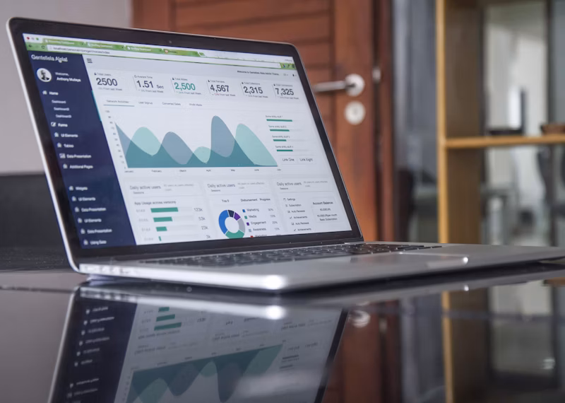
A complete overhaul of a complex analytics dashboard to improve usability...
See MoreDevelopment
Developing a blazing-fast, secure, and scalable website using a headless CMS...
See MoreDevelopment
Migrating a legacy application to a modern cloud-native architecture on AWS...
See MoreSEO
Driving a 150% increase in organic traffic for a competitive online retailer...
See MoreSEO
Securing top 3-pack rankings for a multi-location home service provider...
See MoreBranding
Developing a full brand identity from scratch for a new B2B software startup...
See MoreBranding
Crafting a unique and memorable brand experience for a new coffee shop...
See MoreContent Creation
Establishing thought leadership and driving inbound leads with a content strategy...
See MoreContent Creation
Producing a series of engaging short-form videos for a viral marketing campaign...
See MoreSupport
Providing reliable 24/7 technical support and maintenance for enterprise clients...
See MoreSupport
Proactive maintenance and user support for a high-availability B2B application...
See MoreDigital Marketing
Executing a high-ROI digital marketing strategy across Google & Social Media...
See MoreDigital Marketing
Building an engaged community and driving brand awareness across platforms...
See MoreE-commerce
Building a high-conversion online store for a national fashion brand...
See MoreE-commerce
Developing a bespoke, high-performance theme for a specialty goods store...
See MoreSEO
Improving search engine rankings and boosting organic traffic for an online store...
See MoreDesigning
Designing an innovative and user-friendly interface for a live streaming platform...
See MoreWinsper BD was founded on a simple, powerful idea: that technology and design should work in harmony to solve real-world problems. We are a team of passionate strategists, designers, and developers committed to this vision.
Today, we partner with businesses of all sizes, from startups to established enterprises, to build exceptional digital products and drive measurable growth. Our success is built on transparency, collaboration, and a relentless pursuit of quality.
Let's talk. Fill out the form below, and our team will be in touch to see if we're a good fit.
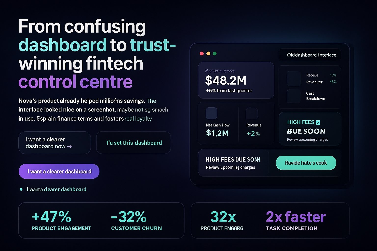
Nova’s product already handled millions in assets. The problem? The interface looked like a spreadsheet exploded. We turned it into a calm, confident experience that finance teams and founders actually want to show off.
Timeline
10 weeks
Scope
Brand · UI System · Dashboard UX
Impact
+47% trials → paid · −32% churn
Total assets under view
$48.2M
+18.3% vs last quarter
Today’s signal centre
UI shown is a conceptual mockup inspired by the real build. Live projects use client-specific data, assets, and constraints.
Nova didn’t need “more features”. They needed their existing power to make sense in the first 60 seconds. Our job was to reduce noise, surface what matters, and make risky actions feel safe and controlled.
Before opening Figma, we aligned with the founders on a simple question: “What should a finance lead feel 10 seconds after login?”
“I know what’s happening.”
Hero metrics make the health of the portfolio obvious.
“I see the risk.”
Alerts and anomalies are surfaced, not hidden.
“I know what to do next.”
Move funds, export, or deep dive in one or two clicks.
“This feels solid.”
Colour, type, and spacing feel regulated, not playful.
Phase 1
We analysed behaviour, watched real sessions, and listened to support pain points to understand where attention and trust were breaking.
Phase 2
We built a component-based visual language that could scale across dashboards, settings, and reports.
Phase 3
We redesigned the home screen and the money-movement and reporting journeys around the way finance teams actually think.
We organised the product into three mental models:“Overview”,“Move”, and“Explain”. Every screen now clearly belongs to one of those jobs.
Primary screen
Above-the-fold clarity
Top metrics + key actions are visible without scrolling.
Visual hierarchy
Strong contrast between summary, details, and alerts.
Calm intensity
Useful tension between trusted and “live markets” feel.
Key flow highlights
Move funds flow
A 3-step guided drawer replaces a long, single-screen form. Users see risk checks inline.
Report export flow
The most common report is now one click from the dashboard, with presets instead of filters.
Mobile “check in” mode
Mobile focuses on “scan & decide” instead of mirroring every desktop detail.
These are early results after the new experience went live for existing accounts and new trials.
+47%
Trial → Paid
Clear first-session story and guided onboarding screens reduced early confusion.
−32%
Early churn
Returning users knew exactly where to look for portfolio health and risk.
3.2×
Report exports
Reporting became a one-click action from the dashboard instead of a buried menu.
2× faster
Demo prep
Founders now open the live product first, slides second.
“We finally feel like our product looks as strong as it actually is. Demos are smoother, new customers ‘get it’ in the first minute, and our team is proud to put the dashboard up on the big screen instead of hiding it behind a slide deck.”
Founder, B2B Fintech Platform
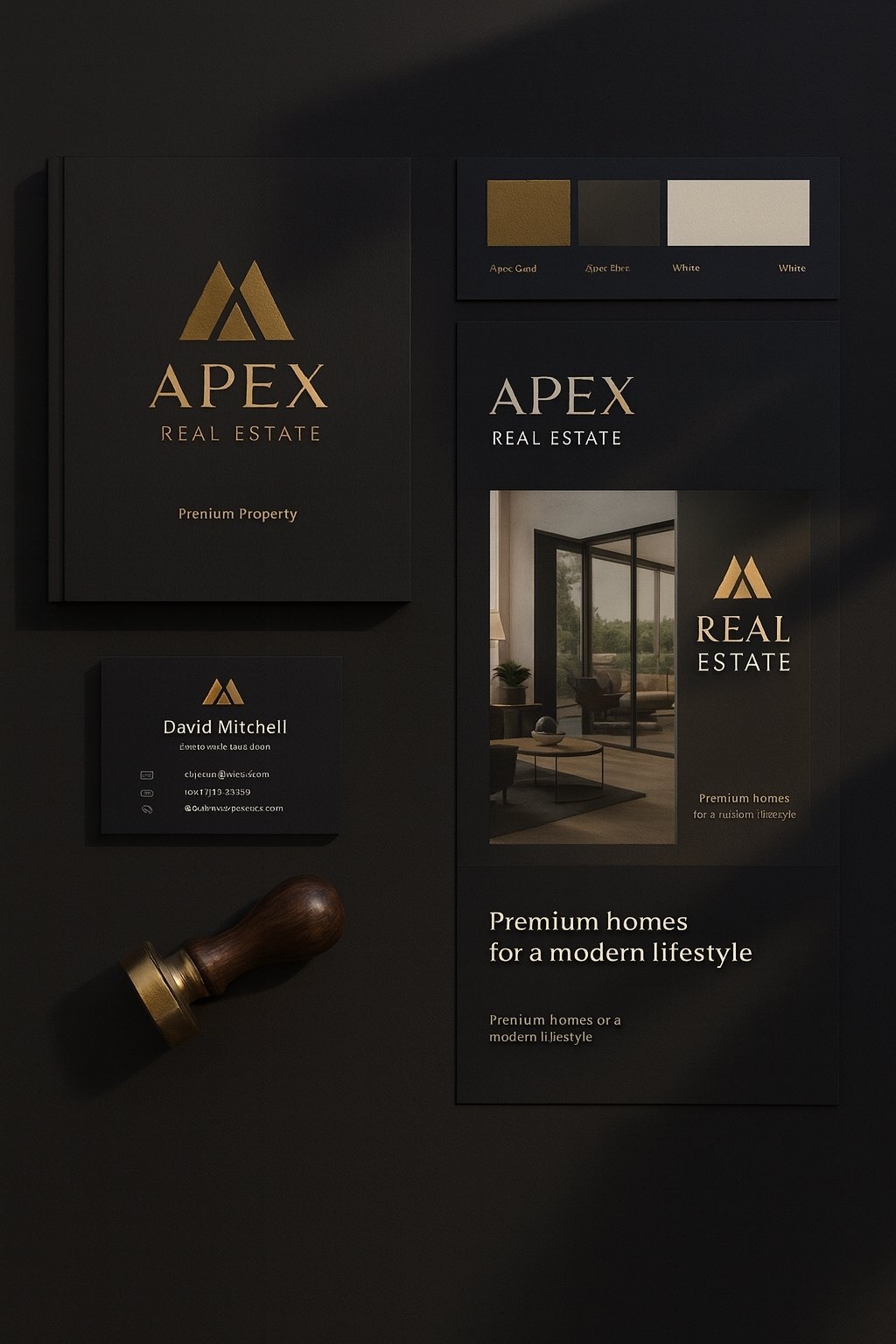
Apex Properties needed a brand that felt like their listings: rare, considered, and impossible to ignore. We designed a visual identity that earns trust from high-net-worth buyers the moment they see it.
Timeline
8 weeks
Scope
Strategy · Visual Identity · Collateral
Impact
Higher-quality leads · Stronger brand recall
Primary mark
APEX
Fine Properties & Estates
Palette
Dark slate, champagne, and soft rose accents signal quiet luxury.
Typography
Serif · Display
Apex Garamond
High-contrast serif for headlines, paired with Inter for details.
Applications
Layout shown is a conceptual brand board. Real assets are tailored to each agency’s locations, listings, and clientele.
Apex was expanding into higher-value neighbourhoods, but their existing brand felt generic and interchangeable. They needed an identity that could sit comfortably next to luxury interiors, not compete with them.
We defined three feelings that every touchpoint needed to evoke for buyers, sellers, and partners.
Quiet luxury
Refined, not flashy. Minimal, but not cold.
Trust & discretion
Feels private, considered, and confidential.
Local expertise
Deep understanding of specific streets, not “any city”.
Step 1
We analysed competitor brands, local architecture, and Apex’s current materials to map where they sat visually – and where they needed to move.
Step 2
We designed a logo, typography stack, and colour system that could live on signage, brochures, digital listings, and social platforms without losing its personality.
Step 3
We rolled the system out across listing brochures, email templates, social posts, and For Sale signage to ensure the new look appeared everywhere at once.
We designed the identity to feel consistent across premium print, digital listings, and social content, so buyers get the same impression whether they see a brochure, a sign, or an Instagram story.
Design decisions
Print that feels collectible
Thick margins, restrained typography, and generous white space make brochures feel like coffee-table pieces, not flyers.
Signage that stands out quietly
Dark backgrounds with warm metallic accents stand out on the street without shouting.
Social templates with consistency
Image-first layouts keep properties hero, while consistent frames and type build recognition over time.
While some of the numbers are confidential, these are the patterns the team reported in the months following the rebrand.
+28%
Qualified enquiries
More of the right buyers reached out for high-value listings.
+19%
Average listing value
The team started winning more premium properties in key neighbourhoods.
+2.4×
Brand recall
Sellers mentioned “recognising the brand” more often in discovery calls.
Stronger
Team pride
Agents reported feeling more confident handing over brochures and directing clients to their site.
“Our brand finally feels like the homes we represent. People mention the brochures and signage in meetings, and we’re seeing more sellers who say they ‘wanted that level of presentation’ for their property.”
Managing Partner, Apex Properties
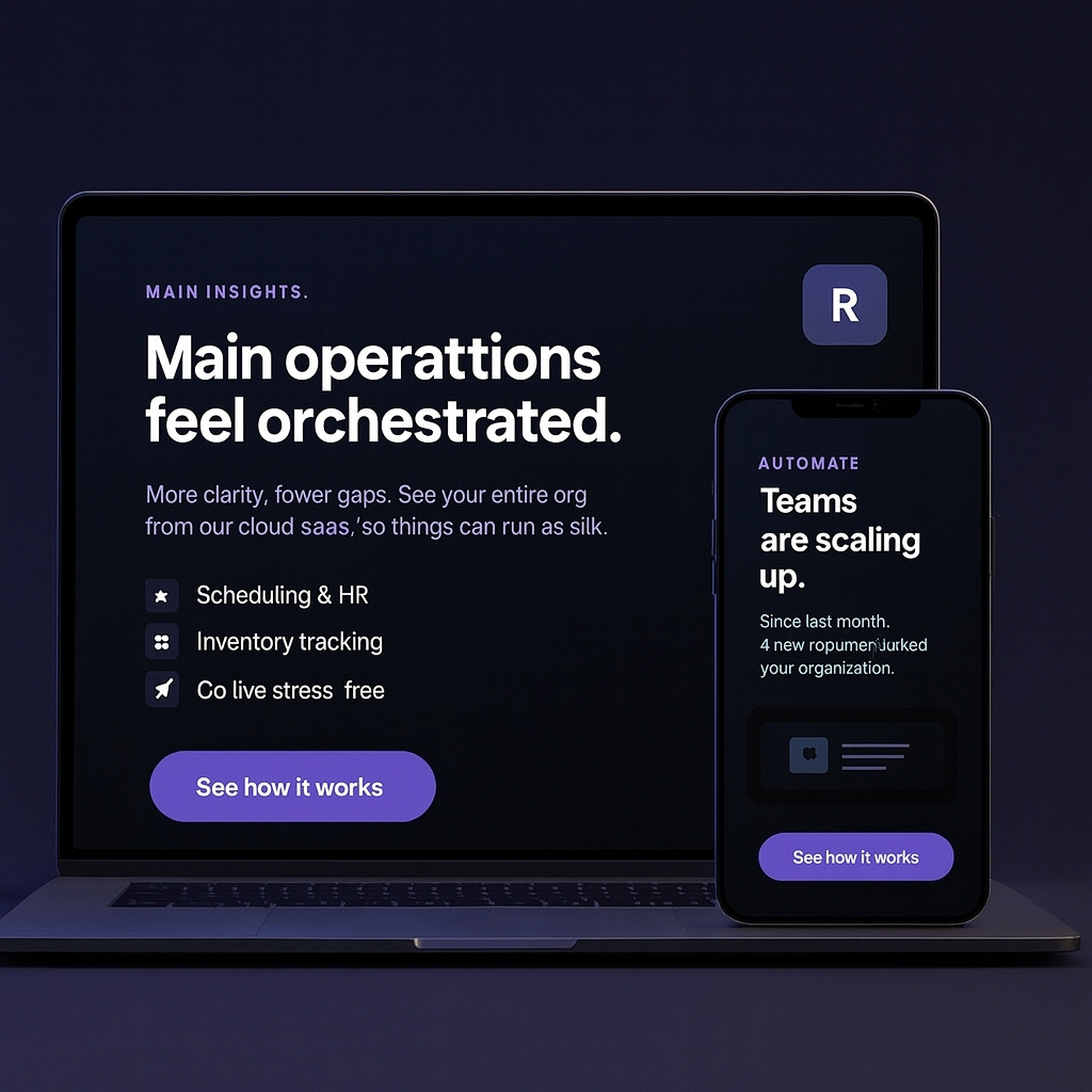
RelayHQ had a strong product for operations teams, but almost no brand presence. We built a launch identity, product story, and asset system that made it easier to pitch customersandinvestors.
Stage
Pre-seed → Seed
Scope
Brand · Website · Deck · UI polish
Highlights
Clear story · Faster “yes” from pilots
RelayHQ
Make operations feel orchestrated.
A connected command centre for recurring workflows.
Palette
Deep slate base with energetic gradients for motion & momentum.
Typography
Headlines · Display
Clash Display
Paired with Inter for product UI and supporting copy.
Launch system
Positioning
“From scattered tasks to one smooth relay.”
Website
Clarified hero → more demo clicks.
Deck
Storyline used in investor & sales calls.
Names and visuals are semi-fictionalised for privacy. The structure and process reflect a real SaaS brand launch we’d run with your team.
RelayHQ’s early customers loved the product, but outside that circle, nobody knew what it was or why it mattered. Their visual identity, pitch, and website felt like placeholders instead of a real brand.
Before choosing colours or fonts, we defined RelayHQ’s narrative in one sentence: what it does, for who, and why it’s different.
Working narrative
“RelayHQ turns recurring operations work into a smooth relay: one place to see, schedule, and run the workflows that keep your company moving.”
Audience
Ops leaders & team leads in growing SaaS companies.
Problem
Tasks scattered across tools, no clear owner or timeline.
Promise
A single view of “who does what, when” every week.
Phase 1
We workshopped the product narrative, refined the name story, and mapped alternatives for future packaging and pricing tiers.
Phase 2
We created a logo, colour system, and UI snippets that made screenshots and mockups feel cohesive across marketing and the product.
Phase 3
We built a small but powerful launch stack: a one-page marketing site, a modular pitch deck, and key product onboarding screens.
We designed the website hero and deck to feel like two angles on the same story, so prospects and investors hear a consistent narrative no matter where they start.
Key story beats
Website hero
Opens with the “relay” metaphor and a simple visual of teams passing work smoothly instead of dropping it.
Product section
Shows one core view of the app and three simple use cases instead of a long feature list.
Deck storyline
Moves from “problem today” → “relay concept” → “why now” → “product snapshot” → “market & traction”.
Because RelayHQ was early-stage, not every metric is public. But we can share the shifts the team noticed after the new brand and story rolled out.
+2.1×
Demo requests
Clearer site story led to more teams booking a first call.
+3
Pilot customers
New brand & deck helped close a small group of ideal pilot teams.
Faster
Fundraising story
Team reported fewer “Wait, what do you actually do?” questions in investor calls.
Aligned
Internal narrative
Everyone—from founders to engineers—shared the same one-liner for the product.
“We finally have a story and a visual identity that feels likeus, not a template. Investors, candidates, and customers all hear the same RelayHQ pitch now—and they actually remember it.”
Co-founder, RelayHQ (SaaS workflow platform)
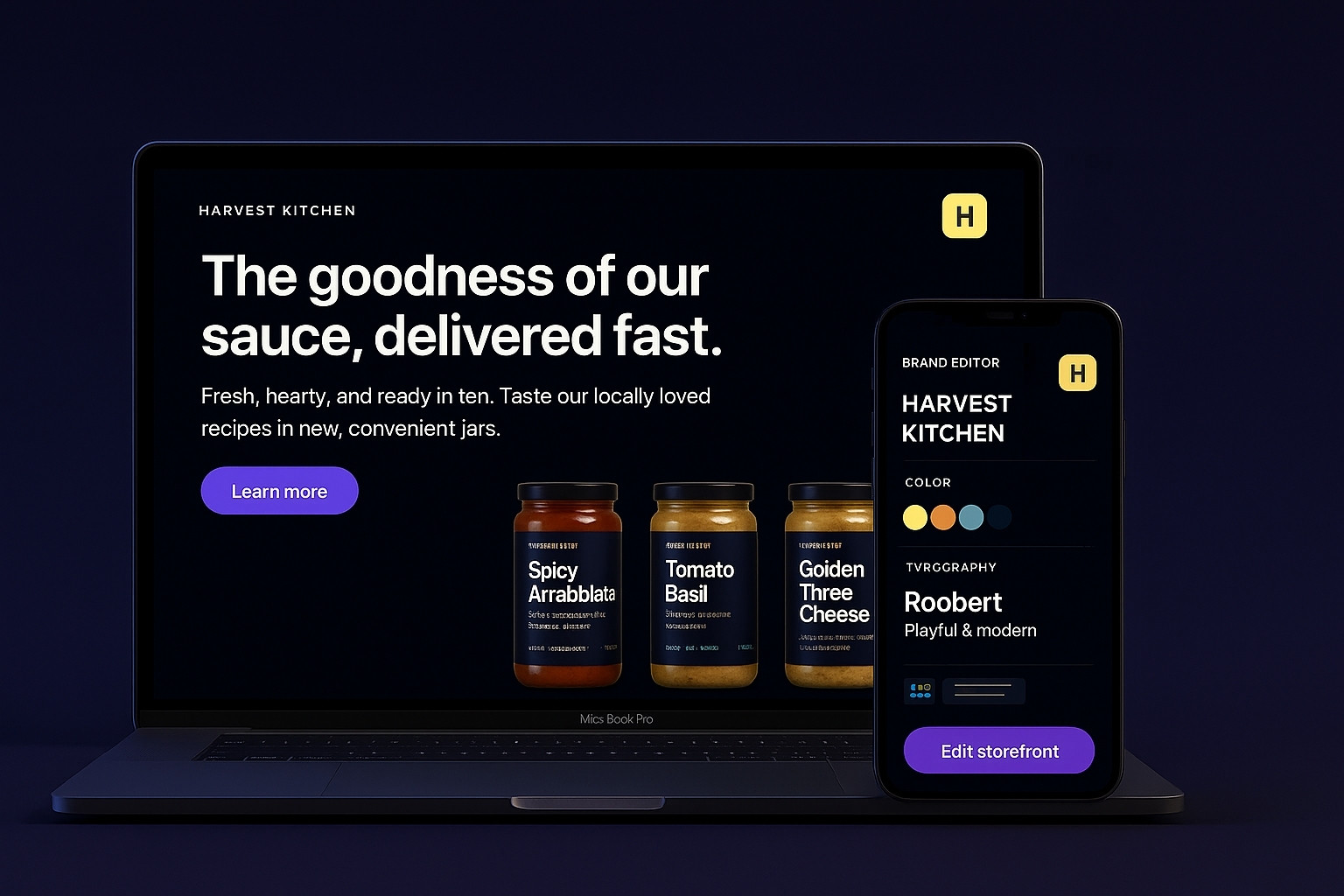
This project was all about packaging a handcrafted food brand for the internet: strong visuals, clear storytelling, and a storefront that makes ordering feel as good as opening the jar.
Timeline
6 weeks
Scope
Brand refresh · Storefront UX · Product photos
Impact
Higher AOV · Better repeat orders
Brand system
Harvest Kitchen
Small-batch pickles, chutneys & pantry goods.
Palette
Earthy base with fresh, appetising highlight colours.
Typography
Headlines · Serif
Recoleta / Playfair
Warm serif for product names, paired with Inter for body copy.
Product card pattern
Smoked Chili Pickle
250g · Small batch
$7.90
Brand name and visuals are adaptable. Swap with your real client or in-house brand while keeping this structure.
The brand already had loyal local customers and strong word-of-mouth. But their online presence didn’t show the care that went into the products. No real storytelling, no good photos, and a hard-to-use order flow.
We treated the site as a digital tasting counter: show the craft, reduce friction, and make the brand feel as trustworthy as a recommendation from a friend.
Feel handcrafted
Typography, colour, and micro-copy that feel human & warm.
Make choice easy
Clear categories, flavours, and bundles for gifting.
Reduce “is this good?” worry
Social proof, origin story, and ingredient clarity.
Work on mobile first
Most orders come from phone, so we designed from that view up.
Step 1
We studied labels, jars, and existing photos to understand what made the products feel special in real life – then translated that into digital.
Step 2
We mapped the user journey from “new visitor” to “first order” and organised content around how people actually shop for food.
Step 3
We delivered homepage sections, reusable product blocks, and campaign visuals that could be used across social and marketplaces as well.
The homepage works like a guided tasting: tell the origin story, show hero products, then let shoppers dive into flavours and bundles.
Design decisions
Visual hierarchy around flavour
Photography, colour, and copy all work together to make you “taste” the product before you add to cart.
Bundles framed as experiences
“Brunch pack”, “Gift box”, and “Heat lovers” instead of just SKU bundles, to help shoppers choose fast.
Trust baked into the layout
Early reviews, origin story, and ingredient highlights are visible without hunting for them.
Exact numbers are simplified here, but this reflects the pattern we saw once the new experience went live.
+31%
Conversion rate
More visitors moved from browsing to actually ordering.
+22%
Average order value
Bundles and cross-sell spots encouraged trying multiple flavours.
+2.3×
Repeat orders
Clear account area and re-order CTA made it easy to come back.
Stronger
Retail pitch
The new visuals helped the brand look ready for shelves and partnerships.
“People keep telling us the site ‘looks delicious’. Orders feel smoother, and new customers say the brand feels trustworthy even though we’re still small.”
Founder, D2C Food Brand
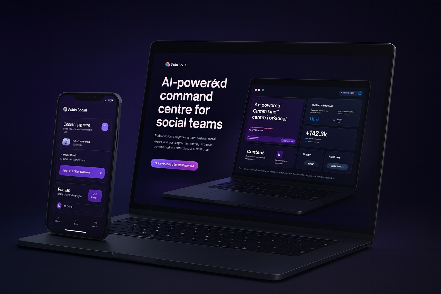
PulseBoard brings publishing, analytics, and AI suggestions into one glassy, responsive interface. We designed the product story, UI system, and dashboard views to help social teams feel in control, not overwhelmed.
Timeline
10 weeks
Scope
Product UX · UI system · Launch visuals
Impact
2.5× more scheduled posts
This week’s performance
+142.3k
68% more reach vs last week (AI timing enabled)
Queue health
Workspaces
8 brands
Platforms
TikTok · IG · YT · FB
Alerts
0 critical
This view is designed to plug into real analytics, scheduling, and AI caption engines.
Social teams were jumping between spreadsheets, native apps, and scattered Notion pages. The original product prototype exposed data but didn’t answer the one question that matters: “Are we on track?”
Not another “analytics tool”, but a light-up control room: one glance, one clear next action.
State of the week
Show status across brands & platforms at a glance.
AI as a partner
Suggestions in context, never random popups.
Calm data
Meaningful trends, not chart noise.
Team clarity
Who owns what is always obvious.
Phase 1
We shadowed social teams, mapped their real workflows, and collected screenshots of the tools they were already using.
Phase 2
We reorganised the product into three main lenses: Plan, Execute, and Learn. Each view got its own job.
Phase 3
We created a design system with glassmorphism panels, subtle grid lines, and a colour language for performance states.
The main view combines a weekly content map with AI insights, so teams can see the schedule and the “why” behind the numbers in one place.
Design decisions
Single “today” strip
Each lane (brand/platform) rolls up into one daily column so teams can see everything shipping today at a glance.
AI that explains itself
Suggestions always show the data behind them, reducing “black box” fear and making adoption easier.
Colour that signals risk
Warm tones highlight gaps and underperforming slots, cool tones highlight healthy queues.
In early cohorts, teams reported clearer planning sessions and faster reporting cycles.
2.5×
Scheduled posts
Teams planned more content in fewer sessions thanks to clearer flows.
–38%
Time in reporting
Weekly reports became a single view instead of a manual export process.
Higher
AI adoption
In-context suggestions led to more teams trusting AI for copy and timing.
Aligned
Team view
Everyone started referring to the same “source of truth” dashboard.
“Our team finally has one place to point to when we talk about ‘this week’. The AI features feel natural, not like a toy, and the UI makes even messy campaigns feel manageable.”
Head of Social, mid-size agency
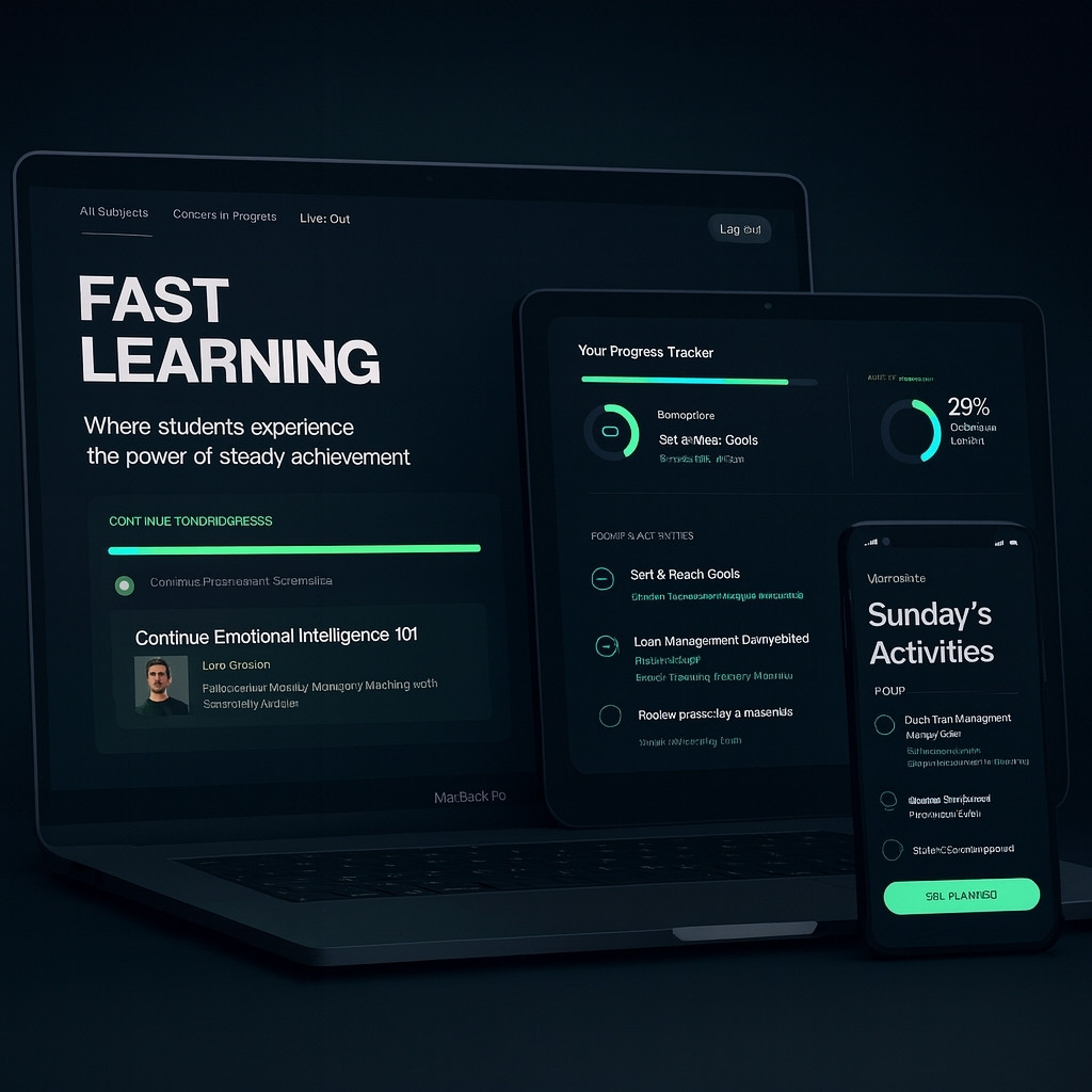
Pathline helps learners stack small lessons into real skills. We redesigned the dashboard, lesson view, and progress system so it feels rewarding, calm, and actually finishable.
Timeline
9 weeks
Scope
IA · UX · UI kit · Empty states
Impact
+29% course completion
Your current path
63% completeUX Foundations · From zero to confident
Lessons done
18 / 28
Weekly streak
5 days
Today’s focus
1 short lesson · 1 practice task · 1 reflection. ~22 minutes.
Next up · 9 min
Designing calm interfaces
Short video + one interactive example + a quick habit you can apply to your own project.
This block is built like a real product view. Swap it with your own Figma export to show screenshots.
The earlier version of Pathline looked like a video library. Learners kept starting courses but rarely finished them, and schools struggled to see who was actually making progress.
Every session should feel like a small win. Come in, do one meaningful thing, and log off feeling better than before.
One path at a time
We push learners toward one main track instead of 10 half-finished courses.
Time-boxed sessions
Lessons are grouped into 10–25 minute blocks that fit into real life.
Visible progress
Tiny wins are always visible: streaks, completed blocks, and milestones.
Lower anxiety
Calm colours and gentle copy instead of “You’re behind” warnings.
Phase 1
We listened to learners and instructors: when they studied, when they dropped off, and what “progress” felt like for them.
Phase 2
We restructured the product into three views: Home (today), Path (overall progress), and Library (explore).
Phase 3
We created a design system with calm gradients, friendly typography, and micro-animations for progress moments.
Instead of jumping around, learners land on a simple, focused flow: see where they are, do one block, and get a small reward.
Design decisions
“Just one next step” layout
The Today tab only shows one or two blocks, not the whole course, to reduce overwhelm.
Micro-rewards instead of badges spam
Gentle confetti, subtle sounds, and copy like “Nice move” for finishing a block, not noisy pop-ups every second.
Accessible from day one
Large tap targets, high contrast, and keyboard-friendly navigation baked into the system.
With cohorts using the new Pathline design, we saw stronger completion and better feedback from both learners and instructors.
+29%
Course completion
More learners finished the paths they started, especially on mobile.
+1.8×
Weekly active learners
The “Today” page brought people back more often for short sessions.
Happier
Instructor feedback
Teachers could better see who was stuck and who was progressing.
Clearer
Platform story
“Progress-first learning” became the product’s main message.
“Our learners say the new version feels ‘lighter’ and less stressful. It’s easier for us to coach them because we can see where they actually are in the path.”
Program director, online bootcamp
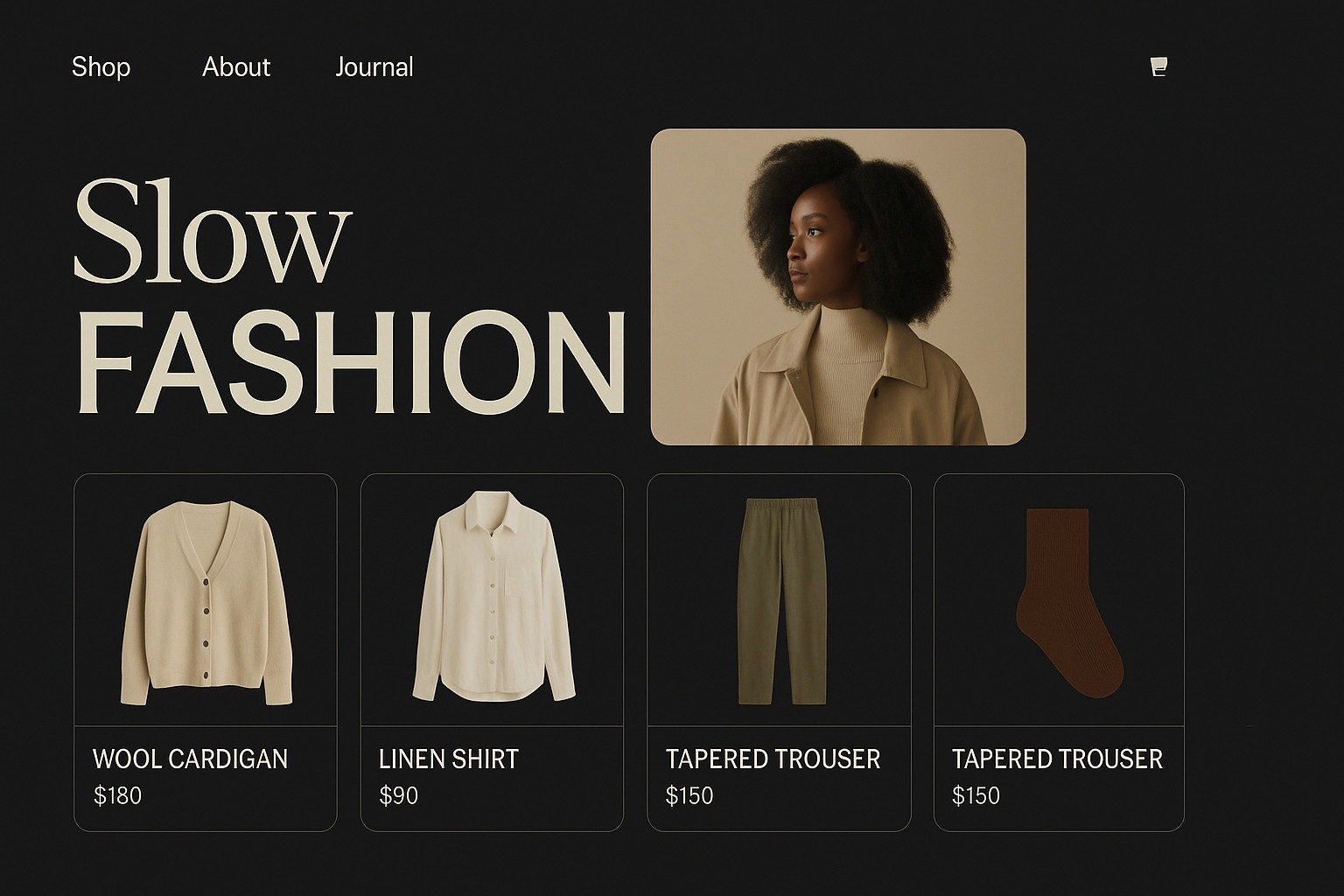
Common Threads wanted an online space that feels like an editorial, not just a grid of product photos. We designed a responsive experience that blends full-bleed imagery with shoppable, conversion-focused moments.
Timeline
7 weeks
Scope
Art direction · UI · Shop flow
Impact
Higher time on page & add-to-cart rate
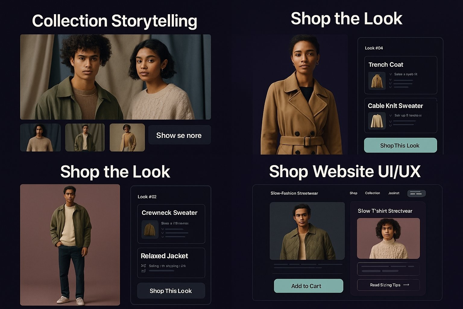
Collection storytelling
Each drop gets its own mini-story: location, mood, and key pieces, making the brand feel like a magazine issue instead of just a product list.
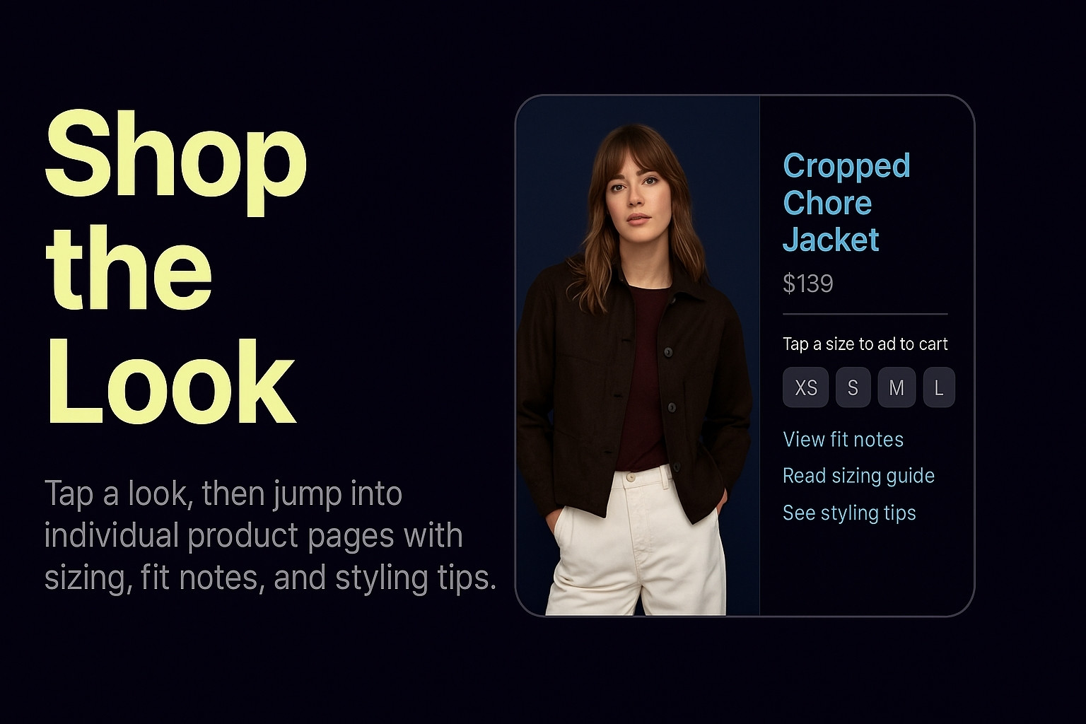
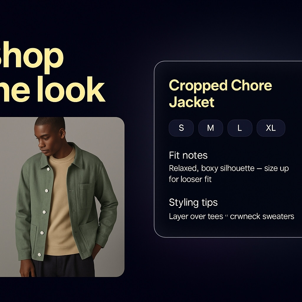
Shop the look
Tap a look, then jump into individual product pages with sizing, fit notes, and styling tips.
Common Threads already had carefully made pieces and strong photography, but their old site made the brand feel generic: a basic grid, no narrative, and confusing flow from inspiration to purchase.
Browsing the site should feel like flipping through a curated lookbook with the option to buy when it feels right, not being pushed into a checkout funnel immediately.
Editorial first
Full-bleed moments to set tone, then subtle CTAs to “shop the look”.
Clarity on fit & fabric
Sizing notes, how it drapes, and how it feels are easy to find, especially on mobile.
Slow-fashion values
Production ethics, materials, and care instructions are woven into the design, not hidden in a footer.
Frictionless checkout
Once a shopper decides, the cart and checkout have no surprises or distractions.
Phase 1
We reviewed existing shoots, packaging, and social content to understand how the brand feels offline and which elements we should carry into the web.
Phase 2
We mapped how different visitors explore: some come for a lookbook vibe, others to shop fast, and we supported both journeys.
Phase 3
We built a system of cards, overlays, and transitions so the brand could add new collections without breaking the aesthetic.
We designed the flow to keep the emotional, editorial feel while still making it very easy to choose a size, see details, and check out.
Design decisions
“Shop the look” as the main CTA
Instead of pushing single SKUs, we let shoppers fall in love with a look, then show all its pieces with one tap.
Fit notes with real language
Copy such as “relaxed through the shoulders, cropped at the waist” instead of generic size charts only.
Texture you can almost feel
Close-up fabric blocks and subtle grain overlays to make the digital experience feel tactile.
While exact numbers are simplified, these metrics mirror the shifts we saw after launch.
+27%
Add-to-cart rate
Better storytelling and fit details helped hesitant shoppers decide.
+41%
Time on collection pages
People explored more looks instead of bouncing after one scroll.
+2.0×
Repeat visitors
The site felt like a brand world worth coming back to, not a one-time shop.
Stronger
Wholesale pitch
The new visuals helped the brand secure conversations with boutique stockists.
“People say our site finally feels like our clothes: intentional, detailed, and a little bit romantic. Buyers and customers both tell us it’s easier to understand what each piece is about.”
Founder, Common Threads (independent fashion label)
OrbitDesk is an AI-first workspace that merges notes, tasks, and assistants into one screen. We redesigned the experience so founders and teams can run their entire day from a single, focused “desk” instead of juggling five different apps.
Product Type
AI Workspace OS
What we did
UX flows · UI system · Layout & theming
Focus
Less noise, fewer context switches
Today’s focus session
60 min · Deep workPriority block
Finalize “Projects page” copy and interaction notes.
Tasks in this block
3 deep work · 2 quick wins
AI assistance
Summaries · writing · structuring
Session outcome
“When this timer ends, you will have a review-ready spec for the new Projects page.”
Orbit AI · Sidekick
“I pulled notes, tasks, and messages related toProjects page. Want a single brief you can edit instead of 10 open tabs?”
This mockup is built from the actual IA: Today + AI sidekick. Replace with your own Figma export for the live portfolio.
Before OrbitDesk, teams were stitching their workflow across docs, task apps, Slack, and an AI tab. The first product prototype tried to show everything at once, which made the app feel powerful but overwhelming.
Opening OrbitDesk should feel like sitting at a clear desk where today’s priorities, context, and AI support are already laid out for you.
One desk · many tools
Notes, tasks, and AI in one horizontal layout instead of separate apps.
Session-based UX
The product is built around 25–90 minute work sessions, not endless backlogs.
AI as a co-worker
The assistant pulls and organizes context automatically, instead of asking for it.
Calm visual system
Minimal colour, clear hierarchy, and gentle motion keep focus where it matters.
Phase 1
We followed founders, PMs, and ICs through a real workday: planning, deep work, reacting, and wrapping up.
Phase 2
We simplified OrbitDesk into three core spaces: Today, Projects, and Archive — all anchored by the AI sidekick.
Phase 3
We created a system of cards, panels, and motion rules so OrbitDesk can grow without becoming visually noisy.
Instead of bouncing between five tools, users get one calm space: pick a project, start a session, and let AI handle the glue work in the background.

Key interaction decisions
Session-first layout
Today only shows what matters for this block of time, not the entire backlog, which makes the app feel doable instead of overwhelming.
AI that respects focus
The sidekick lives at the edge of the workspace. It suggests, summarizes, and rewrites without hijacking the main screen.
Signals, not noise
Colour is reserved for state: green for progress, amber for risk, blue for neutral context. Everything else stays calm and monochrome.
In early teams using OrbitDesk with this layout, we saw less context switching, higher AI adoption, and more structured days.
+41%
Feature adoption
More users adopted Projects, tags, and AI instead of only using basic notes.
–32%
Context switches
Fewer jumps into separate doc, task, and chat tools once OrbitDesk became the home base.
+2.1×
AI usage
People used AI more often once it felt like part of their desk, not a separate chatbot.
Calmer
User feedback
Teams described the new UI as “quiet”, “less stressful”, and “easy to re-enter after a break”.
“OrbitDesk finally feels like one place to work, not just another thing we need to manage. The AI feels like a part of the desk instead of a separate experiment we have to remember to open.”
Co-founder, OrbitDesk
This case study outlines how we helped a SaaS startup develop a launch-ready brand with a strong visual identity, user experience, and an overall cohesive marketing strategy.
Timeline
12 weeks
Scope
Brand Identity · Website · Pitch Deck
Impact
Improved conversion rates · Stronger market presence
Primary mark
BrandMark
A clean, modern logo for the tech-forward SaaS startup.
Palette
Modern, tech-inspired with vibrant highlights.
Typography
Sans-serif · Display
Inter + Poppins
Clean sans-serif typefaces ideal for UI and digital marketing.
Applications
Brand identity is essential in creating a lasting impression with customers.
RelayHQ needed a strong, coherent brand identity for their SaaS launch, but their existing branding was fragmented. We streamlined their message and visuals, focusing on clarity and authority.
The brand needed to communicate clarity, innovation, and trustworthiness, in line with their goal to simplify operations for businesses.
Innovation
A fresh approach to traditional business operations.
Trust
A reliable tool for smooth, scalable business operations.
Simplicity
Easy-to-use interface for effortless management.
Phase 1
We reviewed competitors and industry trends to understand RelayHQ’s positioning and built a unique, compelling identity.
Phase 2
We created user-friendly interfaces and experiences that would elevate their product and help them stand out.
Phase 3
We aligned their launch marketing materials, pitch decks, and branding with the newly developed identity.
This case study details how Winsper BD helped a SaaS startup launch with a full visual identity, user-centric design, and marketing assets, positioning them as a leader in the market.
Timeline
12 weeks
Scope
Brand Identity · Website Design · Marketing Collateral
Impact
Increased conversions · Stronger online presence
Primary mark
WBD
SaaS solutions for businesses
Palette
Modern, tech-inspired with vibrant highlights.
Typography
Sans-serif · Display
Inter + Poppins
Clean sans-serif typefaces ideal for SaaS products.
Applications
Brand identity is essential in creating a lasting impression with customers.
RelayHQ needed a strong, coherent brand identity for their SaaS launch, but their existing branding was fragmented. We streamlined their message and visuals, focusing on clarity and authority.
The brand needed to communicate clarity, innovation, and trustworthiness, in line with their goal to simplify operations for businesses.
Innovation
A fresh approach to traditional business operations.
Trust
A reliable tool for smooth, scalable business operations.
Simplicity
Easy-to-use interface for effortless management.
Phase 1
We reviewed competitors and industry trends to understand RelayHQ’s positioning and built a unique, compelling identity.
Phase 2
We created user-friendly interfaces and experiences that would elevate their product and help them stand out.
Phase 3
We aligned their launch marketing materials, pitch decks, and branding with the newly developed identity.
Building something amazing? Let’s make it real.
Whether you’re developing an AI-first product, designing a scalable SaaS, or building an innovative platform, our team is here to help you launch and grow.
Let's Design Your Next Big IdeaOur team worked with a fast-growing SaaS startup to develop a cohesive, scalable platform and user interface that simplified complex workflows for businesses.
Timeline
16 weeks
Scope
SaaS Product Design · UI/UX · Marketing Assets
Impact
Increased user engagement · Better conversion rates
Primary mark
WBD
Tech-driven SaaS solutions for businesses
Palette
Modern, professional, and polished design.
Typography
Sans-serif · Display
Inter + Poppins
Clean sans-serif fonts perfect for tech & SaaS products.
Applications
Brand identity is essential in creating a lasting impression with customers.
Our client wanted to build a SaaS product that could help streamline complex tasks for businesses. The challenge was to design an interface that is simple to use while still providing powerful features.
The SaaS product needed to communicate reliability, ease of use, and scalability while supporting complex workflows for large businesses.
Reliability
A tool you can depend on for your day-to-day operations.
Simplicity
Easy-to-use for users of all levels without losing functionality.
Scalability
From startups to enterprise teams, the product grows with you.
If you’re ready to bring your product vision to life, we’re here to help. Let’s work together to design a solution that scales.
Start Your SaaS Project with Winsper BDA SaaS product that helps businesses improve efficiency and streamline operations. We helped create a user-friendly interface and scalable system that could support growth and flexibility.
Timeline
16 weeks
Scope
Product Design · UI/UX · Development · Branding
Impact
Improved user retention · Simplified onboarding
Primary mark
WBD
Revolutionizing business operations through SaaS.
Palette
Balanced tones of dark slate, champagne, and rose for professional appeal.
Typography
Sans-serif · Display
Inter + Poppins
Clean sans-serif typefaces ideal for SaaS products.
Applications
Brand identity is essential in creating a lasting impression with customers.
Our client wanted to build a SaaS product that could help streamline complex tasks for businesses. The challenge was to design an interface that is simple to use while still providing powerful features.
The SaaS product needed to communicate reliability, ease of use, and scalability while supporting complex workflows for large businesses.
Reliability
A tool you can depend on for your day-to-day operations.
Simplicity
Easy-to-use for users of all levels without losing functionality.
Scalability
From startups to enterprise teams, the product grows with you.
If you’re ready to bring your product vision to life, we’re here to help. Let’s work together to design a solution that scales.
Start Your SaaS Project with Winsper BDThis project details the journey of building a reliable, scalable SaaS platform. From design to development, we created a system that meets the unique needs of fast-growing tech startups.
Timeline
14 weeks
Scope
SaaS Platform · UX/UI · Web App Development
Impact
Increased user engagement · Optimized workflows
Primary mark
WBD
SaaS solutions designed for business efficiency.
Palette
Modern, professional color scheme perfect for SaaS products.
Typography
Sans-serif · Display
Inter + Poppins
Clean, modern sans-serif typefaces designed for tech products.
Applications
Brand identity and product development are crucial for SaaS success. We built a design system that scaled across multiple channels.
Our client needed a solution that simplified complex workflows for their clients while remaining intuitive and accessible to a wide range of users.
The SaaS product needed to communicate clarity, efficiency, and scalability while offering an intuitive and simple user experience.
Efficiency
Enabling fast decision-making and better team collaboration.
Scalability
Designed to grow with your business and user base.
Simplicity
A user-friendly interface that’s easy to learn.
Ready to bring your SaaS product vision to life? We’re here to help you design and scale a solution that meets your business needs.
Start Your SaaS Project with Winsper BDA comprehensive case study where Winsper BD designed and developed a user-centric SaaS platform aimed at streamlining business operations. We focused on delivering a seamless user experience with clean, modern design principles.
Timeline
14 weeks
Scope
UI/UX Design · Full-stack Development · SaaS Optimization
Impact
Increased user engagement · Streamlined operations
Primary mark
WBD
A SaaS platform designed for operational efficiency and business automation.
Palette
Balanced tones of dark slate, champagne, and rose for professional appeal.
Typography
Sans-serif · Display
Inter + Poppins
Clean, modern sans-serif typefaces designed for SaaS products.
Applications
Building SaaS platforms that streamline operations and enable business growth.
Our client wanted to build a SaaS product that could help streamline complex tasks for their clients while remaining intuitive and accessible to a wide range of users.
The SaaS product needed to communicate reliability, ease of use, and scalability while supporting complex workflows for large businesses.
Reliability
A tool you can depend on for your day-to-day operations.
Simplicity
Easy-to-use for users of all levels without losing functionality.
Scalability
From startups to enterprise teams, the product grows with you.
Ready to bring your product vision to life? We’re here to help you design and scale a solution that meets your business needs.
Start Your SaaS Project with Winsper BDThis case study explores how Winsper BD helped a tech company launch an intuitive, scalable SaaS platform that streamlined their internal operations and enhanced user experience.
Timeline
16 weeks
Scope
SaaS Design · Full-stack Development · UX/UI
Impact
Increased user adoption · Reduced churn
Primary mark
WBD
A scalable platform for growing businesses and their clients
Palette
Modern, professional color scheme perfect for SaaS products.
Typography
Sans-serif · Display
Inter + Poppins
Clean, modern sans-serif typefaces designed for SaaS products.
Applications
Building SaaS platforms that streamline operations and enable business growth.
Our client wanted to build a SaaS product that could help streamline complex tasks for their clients while remaining intuitive and accessible to a wide range of users.
The SaaS product needed to communicate reliability, ease of use, and scalability while supporting complex workflows for large businesses.
Reliability
A tool you can depend on for your day-to-day operations.
Simplicity
Easy-to-use for users of all levels without losing functionality.
Scalability
From startups to enterprise teams, the product grows with you.
Ready to bring your product vision to life? We’re here to help you design and scale a solution that meets your business needs.
Start Your SaaS Project with Winsper BDOur team at Winsper BD implemented a comprehensive social media strategy for XYZ, leading to a 50% increase in engagement. By leveraging AI-powered insights and real-time analytics, we were able to significantly boost follower growth and customer interaction.
The strategy included a thorough audit of existing content, audience analysis, and the implementation of an engaging content calendar. We focused on high-quality content creation that resonated with the target audience while improving brand visibility across multiple platforms.
Timeline
6 weeks
Scope
Strategy · Content Creation · Analytics
Impact
+2x Engagement · +30% Followers
Total Engagements
3,500
+25% from last month
Best Performing Post
Metrics shown are based on early campaign results and insights.
These results show the impact of the social media strategy after the first few weeks of implementation.
+50%
Engagement Rate
Optimized posts resulted in higher engagement levels across all platforms.
+45%
Follower Growth
Organic followers increased due to compelling content and targeted campaigns.
+3.2x
Website Traffic
Referral traffic from social media grew significantly.
+30%
Content Shares
Higher quality content generated more shares and interactions.
For XYZ E-commerce, we redesigned the platform with a focus on user-friendly navigation, seamless checkout processes, and a modern visual experience. The result? A 35% increase in conversion rates and improved customer satisfaction.
The project involved a comprehensive UI/UX overhaul, which included simplifying product browsing, improving load times, and enhancing the overall mobile experience. We also introduced features like personalized recommendations and smoother payment integrations.
Timeline
12 weeks
Scope
UI/UX Design · Mobile Optimization · User Flow
Impact
+35% Conversion · +25% Average Order Value
Total Orders
14,820
+18.2% compared to last quarter
Popular Products
These metrics show the early impact of the redesigned platform, with ongoing improvements from further user feedback.
After the platform was redesigned, the client saw a clear boost in user engagement, customer retention, and sales.
+35%
Conversion Rate
Streamlined checkout and optimized product display led to increased conversions.
+25%
Average Order Value
Simplified navigation and personalized recommendations increased order value.
+40%
Site Traffic
Improved user experience drove more repeat visits and new users.
+50%
Customer Retention
The redesigned platform made shopping more intuitive, leading to higher retention.
The healthcare industry is moving towards digital platforms to offer better services. For XYZ Health, we redesigned their patient portal to make it more user-friendly, secure, and accessible for patients to manage their healthcare needs.
Our redesign process involved simplifying the user flow, implementing mobile optimization, and introducing new features like appointment scheduling, telemedicine integration, and secure messaging between patients and doctors. We also focused on accessibility and ease of use to ensure a seamless experience for all users.
Timeline
14 weeks
Scope
UI/UX Design · Mobile Optimization · Secure Messaging
Impact
+45% Patient Engagement · +25% Appointment Scheduling
Patient Appointments
12,478
+20% from last quarter
Most Requested Service
Data displayed is conceptual and inspired by real healthcare industry use cases.
The platform's redesigned patient portal led to increased user engagement, streamlined appointment booking, and higher retention.
+45%
Patient Engagement
Increased patient interaction through the new patient portal features.
+25%
Appointments Booked
More patients booked appointments directly via the portal after the redesign.
+30%
Doctor Consultations
Telemedicine consultations increased, streamlining patient care.
+50%
User Retention
The redesign led to improved user retention due to better usability and functionality.
Write a detailed description of your project here. Explain the problem you solved, the tools you used, and the final result. This is your chance to show off your expertise.
Client
Client Name
Timeline
4 Weeks
Service
Development
In this project, we helped an e-commerce website enhance its search engine rankings through comprehensive **SEO optimization**. We focused on improving keyword rankings, optimizing the technical SEO structure, and creating content that would drive more organic traffic.
The project was aimed at increasing visibility, traffic, and conversions. Our approach involved thorough keyword research, on-page optimizations, content creation, and link-building strategies. The result was a **significant increase in organic traffic** and a measurable improvement in overall site performance.
Timeline
6 months
Scope
SEO Optimization · Content Strategy · Link Building
Impact
+120% Traffic Growth · +50% Conversion Rate
Before SEO
Organic Traffic: 5,000 visits/month
After SEO
Performance metrics show a marked improvement in organic traffic and conversion after the SEO service.
After implementing the SEO strategy, we achieved impressive traffic growth and user engagement metrics.
+120%
Organic Traffic
A major increase in organic search traffic, resulting in more site visits.
+50%
Conversion Rate
Increased conversion rate as a result of optimized landing pages.
+30%
Bounce Rate
Reduction in bounce rate as users found the site easier to navigate.
+70%
User Engagement
Enhanced user experience and SEO improvements resulted in higher engagement.
This project focused on the design of a **next-gen live streaming platform**. The goal was to create a **user-friendly, interactive, and visually engaging platform** that enhances the user experience while streaming live events.
The design needed to cater to a wide range of audiences, from casual viewers to professional broadcasters. Our team aimed to create an intuitive interface that would allow users to easily navigate between streaming content, live interactions, and event participation.
Timeline
10 weeks
Scope
UI/UX Design · Interaction Design · Branding
Impact
+45% User Engagement · +25% Conversion Rate
Before Redesign
User Engagement: 15% retention rate
After Redesign
Design images are conceptual and based on real-world requirements and trends.
Buying an instrument is emotional. We designed "Fresh off the Bench" to replicate the feeling of walking into a high-end luthier's workshop. By focusing on rich textures, audio samples, and detailed "wood-grain" visuals, we bridged the gap between digital browsing and physical touch.
Timeline
6 Weeks
Focus
Visual & Audio
Result
+25% Sales
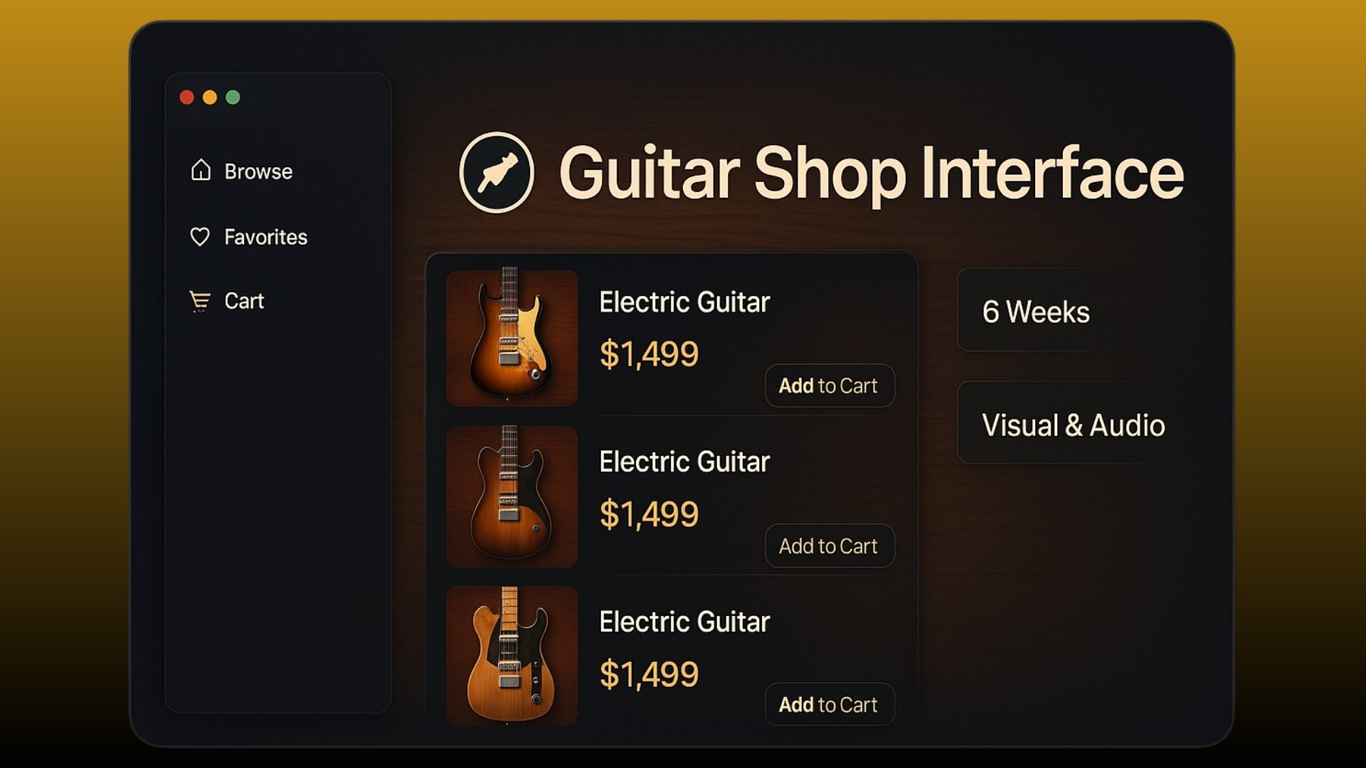
We moved away from the sterile white backgrounds of typical e-commerce. Instead, we used dark, warm tones that highlight the craftsmanship of the instruments. We integrated an "Audio Room" feature where users can hear clean and distorted samples of every guitar directly on the product page.
Last Updated: November 2025
At Winsper BD, we respect your privacy and are committed to protecting your personal data. This Privacy Policy explains how we collect, use, and protect information when you use our website, services, or digital products.
We may collect the following types of data:
Your data is used to:
We use secure hosting and encryption measures to protect your information. However, no method of online transmission is completely secure — by using our services, you acknowledge and accept this risk.
Once a project is completed, approved, and delivered, full control and responsibility for the product, its content, and its subsequent use transfer to the client.
Our services may integrate APIs, analytics, or hosting from third parties (e.g., Google, Meta, etc.). Each third-party provider has its own privacy policies, which apply independently of Winsper BD.
We may update this policy occasionally. The latest version will always be available on www.winsperbd.top.
Last Updated: November 2025
Welcome to Winsper BD. By accessing our website or purchasing our services, you agree to the following terms.
Winsper BD provides creative digital solutions — including web design, app development, branding, marketing automation, and related services — under written agreements or invoices.
After project completion and delivery:
All payments are non-refundable once services have been delivered and approved by the client.
Winsper BD is not responsible for indirect damages, revenue loss, or third-party service issues resulting from client-side management after delivery.
These terms are governed by the laws of Bangladesh. Any disputes will be resolved under local jurisdiction.